How to Access Analytics Data in the Mobility Domain
This howto guides you in browsing and querying data from the Mobility domain using the https://analytics.opendatahub.com/ web site.
Note
Access to data on this website is now possible by using R. See the dedicated section for information and directions.
Introduction
The website https://analytics.opendatahub.com/ gathers data from datasets in the mobility domain and uses them to draw two types of diagram: a chart using historical data and an interactive map that show where are located the sensors on the territory. The latter is the default landing page.
Charts
The charts page contains a number of options to show data, both historical and current, from the mobility domain. Data are gathered by sensors which are installed on various locations in South Tyrol and are operated and governed by different institutions or public and private companies. While the vast majority of the data comes from South Tyrol, there are datasets (including the E-mobility, weather, and traffic domain), which contain data about some neighbouring Italian provinces and regions.
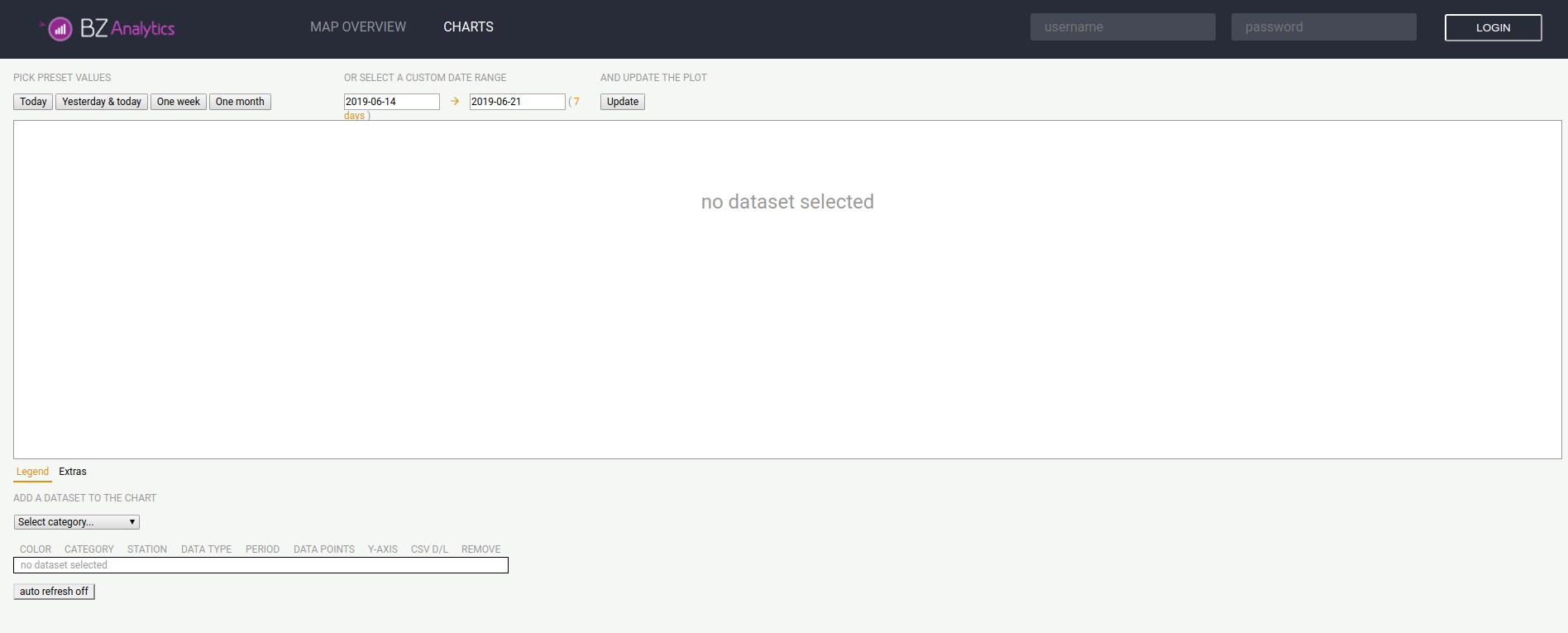
Figure 16 The landing page of analytics.mobility.bz.it.
While there are many controllers in the page, that allow to tweak the search parameter, the basic usage is quite simple and requires two steps:
- Select a dataset to be added to the chart, from the drop-down menus below the diagram.
- Restrict the data to be displayed to a date range, either a predefined one or a custom one.
A sample display from the weather datasets is shown in Figure 17, in which data from only one temperature sensor are used, and in Figure 17, using data from two temperature sensors.
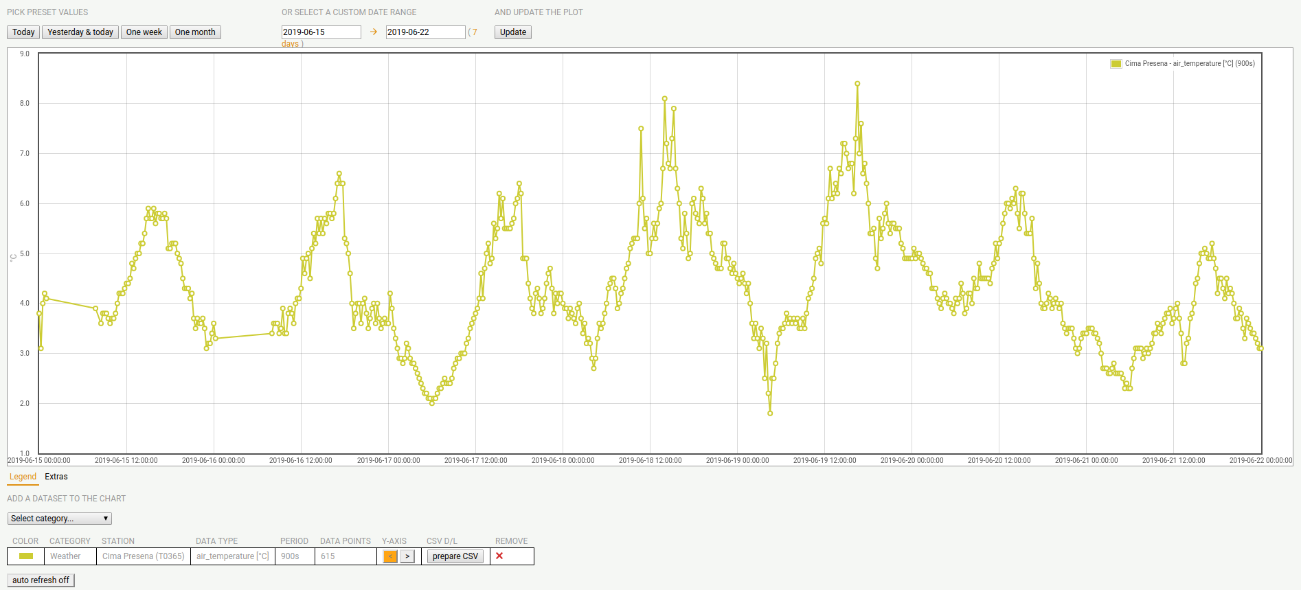
Figure 17 Sample temperature diagram on Cima Presena.
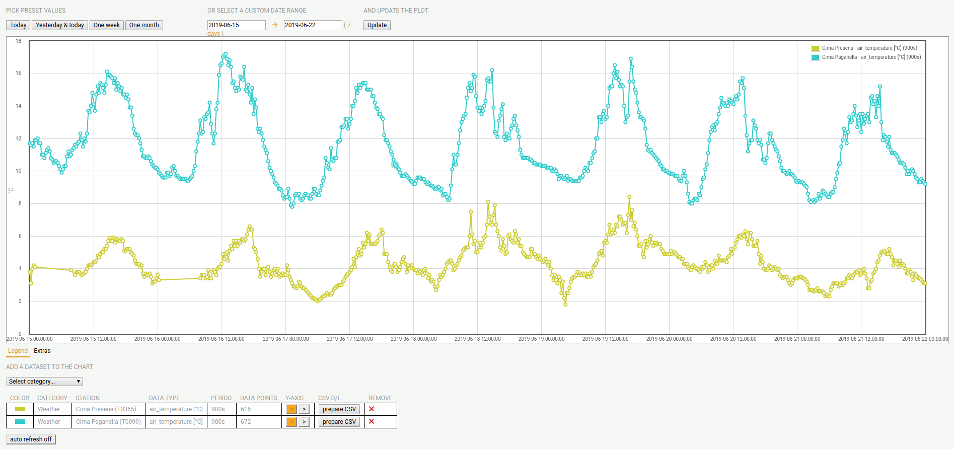
Figure 18 Sample temperature diagram on Cima Presena and Cima Paganella.
Map Overview
In the map overview, there is a map, initially displaying only the South Tyrol region, with the list of available sensor types on the left-hand side. When clicking on one or more items, the position of all sensors will appear on the map, see Figure 19 for the parking lots available in the Trentino-South Tyrol region.
A signpost with a circled + indicates that there are more sensors around at that location; this is true especially when the map encompasses a large area, like e.g., the whole South Tyrol region. Therefore, by zooming in on the map, or by (repeatedly) clicking on the +, more signposts will appear, until the + either disappears or is replaced by a different sign: you have found the (unique) sensor at that location.
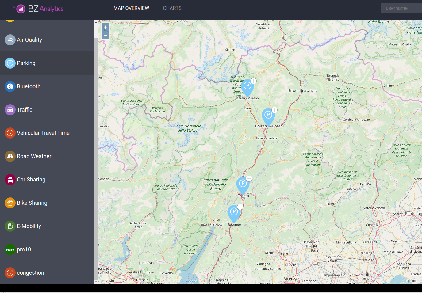
Figure 19 Map with parking lot signposts.
In the case of Parking data–and in a few other datasets, the + will be replaced by a green, yellow, or red circle, meaning that there are many, a few, or no free parkings in that lot.
For other types of sensors, the + simply disappears.
When clicking on a single sensors, a panel will appear on the right-hand side, containing a lot of information about that sensor, including its unique ID within the dataset, geographic coordinates. Additional information displayed depend on the dataset.
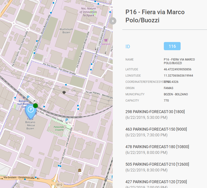
Figure 20 Details of a sensor.